How does colour affect our perception of the interiors?

how does coulour affect our perception of interior

Your home is your sanctuary. How well designed it is will influence your experience, everyday mood, and ultimatelly your quality of life. However, as often as not our homes come with predetermined layouts and orientation. Rooms might feel too small or too narrow, without enough light or with low ceilings. When structural changes are not an option, we need to explore different ways to at least visually change our perception of interiors.

Paint is one of the easiest ways to visually impact the size and appearance of any room. Before choosing colours for your home, you want to understand what effects you want to achieve, or what problems to address. White and light neutrals are the best for making space look bigger, while dark and bold colours make the space seem smaller or more intimate. Many people avoid using darker tones in their space and stay on the safe side with lighter, neutral tones. However, strategic placement and contrast painting may show you the full potential of your own home.

We will explore eight simple paint techniques that visually affect our perception of interiors.

TO ENLARGE THE SPACE
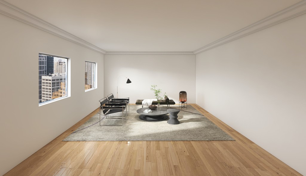
Using whites and light paint colours to enlarge the space.

The proven way to enlarge the space is painting the walls and a ceiling, with whites or light neutral colours. Rooms will instantly look more spacious and even lighter. If the floors are darker, lighter rugs will do the same effect. To achieve an almost invisible border from wall to ceiling, and expand room to look higher, paint them in the same colour.

TO MAKE THE ROOM WIDER

To make the room look wider paint the back wall and a ceiling in dark colours. Side walls keep in lighter tones.

The space will look wider if you use the same dark paint on the back wall and a ceiling. Leaving the side walls in lighter tones will instantly give more spacious look. Think narrow rooms, long corridors or even old fashioned kitchens and bathrooms.

long hall with dark doors and dar ceiling
long hall with bold coloured doors and multicoloured zig zag floor

TO LOWER THE CEILING

to visually lower a ceiling apply dark colours while keeping the walls in whites or lighter tones.

High ceilings are one of the most desirable design elements, giving the instant aesthetic or even luxury appeal to any space. Rooms with high ceilings feel more spacious, have more light and even smaller rooms look bigger. Sometimes however, ceilings may be too high, challenging to decorate or giving a feel of emptiness. There are many ways to create more intimate space with lowering high ceilings but one of the easiest is with paint. The room will feel instantly cosier and visually smaller if you paint the ceilings with darker tones or try using bold colours, like on the pictures bellow.

TO RAISE THE CEILING

to make ceiling look taller, paint the walls in darker tones and keep the ceiling light

A completely opposite situation is when rooms come with lower ceilings, giving a small or cramped feeling. To vertically expand the space and to achieve the appearance of higher ceilings, try painting the walls in darker tones while ceiling stays in white or lighter tones than the rest of the room.

dining room with sage panelled walls and light ceiling

TO HIGHLIGHT THE WALL

creating an accent wall with dark tone walls and back wall in lighter colour

A highlight wall is very effective and eye catching way to accentuate an art or a furniture piece. You might want to keep it in lighter tones than the rest of the room. The same effect can be achieved with a contrast solution when the highlight wall is painted in darker colours. Whichever option you choose, accent walls create a focal point and give depth to a space.

TO NARROW THE SPACE

to make room look narrower, paint in darker tones long opposing walls

If a room feels disproportional, too big or too wide and redesigning is not an option, using just paint may be an effective solution. To visually put a wide room together, apply darker tones on opposing walls. Dark colours absorb light and walls would seem to be closer than they really are. This is an easy and quite effective way to improve the proportions of a room.

TO MAKE THE SPACE SHORTER
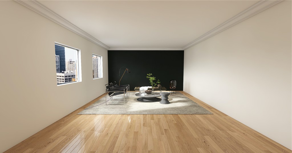
to make room look shorter apply paint in darker tones on the back wall

Another problem with disproportion is when room looks too large or more often corridors and hallways feel uncomfortably long. You might want, to at least visually, make them shorter. One easy way to shorten a room or a hall is by painting the back wall a bold colour. With this technique you will achieve two things; a darker wall seems closer and adding a pop of colour will bring interest and make a statement.

TO COMPACT THE SPACE
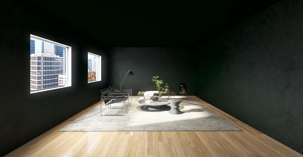
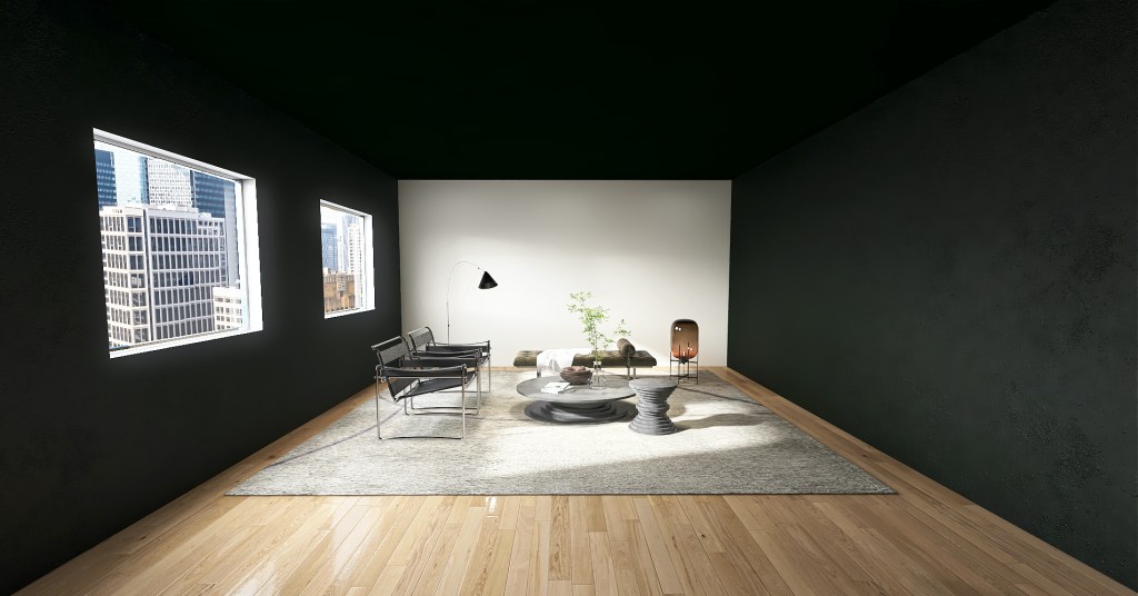
to make room seem smaller, paint the whole room including ceiling in dark tones

Another way to make a room smaller is to choose dark colours and paint them on every wall including the ceiling. As dark colours rather absorb than reflect light, these rooms will be more intimate and darker. Think bedrooms, libraries or spaces where you want to minimise light. Even smaller rooms will feel more elegant and cozy if you paint them like this.

Follow:

Camp Roig 31 by Durietz Design & Development 

Living room, Mallorca townhouse, Came Roig 31 by Durietz Design & Development

Design: Durietz Design & Development

Location: Mallorca, Alaró, Spain

Photography: Piet-Albert Goethals

There is nothing more inspiring than breathing new life into abandoned and old properties. Especially, the ones with good bones and transformation potential. This week, my inspiration quest takes me to Spain, in the small town of Alaró, at the foothills of the Tramuntana mountains (Mallorca).

Camp Roig 31 is a modern family residence, impeccably renovated by Mallorca-based interior design and architecture studio DuRietz Design & Development. It is hard to believe this beautiful house was built originally as a warehouse for crops and meat. Since then it has acted as a shoe factory, an office, and a modest residence to several families, including the mayor of Alaró. When Josephine and Christoffer Durietz acquired the house, it was a complete ruin and abandoned for more than a decade.

Entrance to the Camp Roig 31 House
Staircase, entrance, Mallorca, Cape Roig 31
Entrance to Camp Roig 31 townhouse, Durietz Design

Whoever renovated an old property knows how difficult is to predict the full extension of work. The same was with Camp Roig 31 as the state of the house revealed many construction challenges throughout but also good bones that allowed radical changes. To attain architectural heritage, designers tried to restore many antique details like original stone fireplaces and wooden carvings. They also infused the love for Mallorca lifestyle and tradition to bring out its full potential.

“We see the house fitting perfectly in a toned down art deco inspired theme mixed up with a strong Mallorcan heritage. Working with dramatic shapes created with natural materials and an earthy palette both inside and out. This all the while not loosing the utilitarian roots of the house.”

View from the terrace, Camp Roig 31 Mallorca

With 640 sqm, the century-old building unfolds over three levels, with the possibility of up to eight bedrooms, five bathrooms and a two car garage. For the comfort of the owners there’s also a home office, yoga room and well-stocked wine cellar with 150 bottles of house wine, produced locally on the island at Bodegas Son Puig. A special feature is the spacious roofed terrace with arched openings to the private expansive backyard, with spectacular views of the Alaró peaks.

kitchen, Camp Roig 31, DuRietz Design, Espacio Home Design

Designers entrusted realisation of the kitchen and bathrooms to Espacio Home Design. Custom-made stripped cabinets made from solid walnut and matte varnish finish in combination with light cream travertine surfaces. To add a personal touch, many of the pieces in the home were custom-made by designers. That includes a walnut dining table paired with solid walnut and cotton cord ‘Josephine’ chairs. Also furniture pieces in bedrooms, the marble bedside tables, the study’s desk and wall shelving.

The highlight of the house is certainly 410 sqm private backyard. Featuring a large pool with sundeck, dining area with outdoor kitchen, landscaped garden and a raised terrace over the water tank. Such a generous outdoor space is enjoyable from the early morning sun for breakfast, to the sun-soaked pool deck relax, sunset-blessed veranda and al fresco dinners. Dream house indeed, a retreat place in every sense of the word.  

Get the look

zara terry chair

cassina sofa

knitting chair menu

flos taccia lamp

Daphne wall lights lumina

capitol complex chair casino Pierre Jeanneret

Source: Yellowtrace, for more information about the house before renovation Durietz Design & Development

Follow:

Design trends | Pleats

Salvatori official, Plissé, living room, pleats stones

Pleats are not a new trend, holding a long history as an expressive design element, most notably in fashion. Who doesn’t own at least one pleated skirt or a dress?

In interiors though, we usually spot pleats in different window treatments like curtains or furniture upholstery. In recent years, however, their interpretation goes well beyond interior textiles. I love seeing how the pleated texture, has expanded in different materials, like stone or wood, becoming a trend in three dimensional walls, tiles, decoration or lighting. As they come in a variety of shapes and sizes, pleats have an ability to bring volume and dimension to any material. In combination with natural light, pleated texture creates a perception of movement and depth. If you are looking for a simple way to infuse interest, softens and elegance to your interior space, introducing pleats might be your way to go.

Check out bellow, a few of my favourites pleated designs.

‘Plissé White Edition’ Pleated Textile Table Lamp by Folkform for Örsjö

Plissé wallpaper collection, designed by Lorenzo De Grandis for Wall&Deco

The Plissé collection (kettle) designed by Michele De Lucchi for Alessi

Plissé collection, stone tiles design by Elisa Ossino for Salvatori

Plissé Wood (tables) collection designed by José Manuel Ferrero for Vicaldesign

Plissé Stone (flowerpots) collection designed by José Manuel Ferrero for Vicaldesign

Lamella 132 pendant by Le Klint

Follow:

Miner Road House by Faulkner Architects

Miner Road House by Faulkner architects

Architects: Faulkner Architects

Location: Orinda, California

Photography: Joe Fletcher

The first impressions one might have of the Miner Road House are abundance of light coming through massive window walls, minimalistic interior and lightness of space thanks to the double height ceilings. What is not obvious, however, is that this fully energy efficient home is designed to have almost no impact on the environment. It is refreshing and inspirational to see such a symbiosis of design and nature, with the clear idea that we can live comfortably with the minimum impact on our surroundings.

Miner Road House
Miner Road house

To learn more about the Miner Road house, read description provided by the architects.

The clients are a couple of environmental scientists who, along with their two sons, relocated from the Oakland Hills to the warmer climate of Orinda. Their commitment to sustainability, including a request for net-zero energy performance annually, was evident in their thinking throughout the design process. A three-bedroom program began as a remodel of a 1954 ranch house at the foot of a hill next to a seasonal creek. After finding the existing structure and soils to be unsuitable, the direction settled on reusing the existing footprint under the shade of a Valley Oak that had grown up close to the original house. The surviving portion of the original house is the fireplace which was wrapped in concrete and utilized for structural support. This made additional grading unnecessary and allowed the new house to maintain the same intimate relation to the old oak.

Miner Road Faulkner Arch

The family desired an open living layout that connected directly to the landscape. A mezzanine plan evolved with a double height family space nested with a master bedroom and study stacked above the kitchen and nook. A screened pacing deck for long phone calls shades the upper level from afternoon summer sun. Downstairs, secondary bedrooms along an extendable hallway, wrap an outdoor dining area situated between the kitchen and family room.

Construction materials and methods were considered in balance between first and lifecycle costs. The Corten steel rain screen for the exterior skin and interior wood were chosen to take advantage of zero annual maintenance cost and a shotcrete foundation allowed formwork to be repurposed for wood framing.

Do you know what NET ZERO HOME means?

Over the course of one year, zero energy homes will have their total energy production minus their total energy use, equal zero. This is usually achieved by energy-efficient thermal exteriors and insulation, quality appliances in combination with renewable energy systems.

Single use material selections such as the Corten steel and shotcrete foundation reduced complexity in detailing and labor costs allowing a larger portion of the budget to be reallocated for upgraded mechanical, insulation, and glazing systems. The same attitude for interior finishes produced acoustically insulated, unfinished oak ceilings and walls. The sum total of the limited and landscape-driven materials presents a relaxed and quiet built environment that allows the senses to focus on the natural environment. A haptic connection to the rhythms of our planet is evident.

A 14-gauge Corten rain screen provides a no-maintenance skin. High levels of insulation and glazing efficiency reduce heating and cooling loads. An 8.1kW photovoltaic system provides on-site renewable energy and produced more electrical energy than the house used the first year. Rainwater is collected via a waterfall from the roof at the end of the hallway. Buried tanks store water for use in toilets and laundry. Greywater is collected separately and reused for irrigation. Electronically commutated motors and variable speed heat pumps are used to further limit energy use and control heating and cooling. An energy recovery ventilator is used to provide fresh air.

Source: Faulkner architects

Get the look

Follow:

The Leinster Square project by Banda Property

Banda property

I’ve always loved old city architecture and historic buildings. Try to imagine high ceilings, distinctive mouldings, floor to ceiling windows, wooden floors and open fireplaces. Unfortunately many of them are left to ruin, even on a very good city locations. It is not always the case but sometimes these buildings get not only a facelift but a well thought transformation, awarding it with a totally new life. The way these Victorian terrace buildings on The Leinster Square have been converted, reflects the most sensible mix of historic elements and the modern way of living. Behind of the change is Banda Property, a well known property developer for their ‘design for living’ philosophy and sophisticated aesthetic.

Before renovation, the building was in such a devastating state that the developer could only keep the façades but completely demolished the interior. To keep the historical value, they preserved and then recreated most of the period features such as herringbone parquet floors or mouldings on the ceilings. Installation of modern amenities like underfloor heating and natural air conditioning brought contemporary functionality and comfort. Throughout each of the eight apartments, five maisonettes and two penthouses, you will find a thoughtful aesthetic of a neutral colour palette, natural materials like oak, marble and brass, as well as a curated selection of furniture and art works.

13-19 Leinster Square, Notting Hill, the row of townhouses in 1970s had been converted into a hotel
Curated selection of furniture, lighting and art works
Bespoke Banda Kuvaa Rosso Levanto marble console
Rooms are flooded with natural light from full-height windows
Dominant neutral colour palette throughout the apartment

“I’m drawn to pieces which tell a story, whether it’s the journey of where its material has come from or the person who has made it,” Mapelli Mozzi says. “I might have the big design ideas but it’s the thousands of hands, from Banda’s design team to our many craftsmen, that have brought it to life.”

Versailles parquetry, herringbone and chevron oak wood flooring
Kitchen designed by well known Belgian company Obumex

“Minimising the detailing brings a sense of balance and cleanness to each space, allowing the architecture and spatial planning to shine through” – Edo Mapelli Mozzi

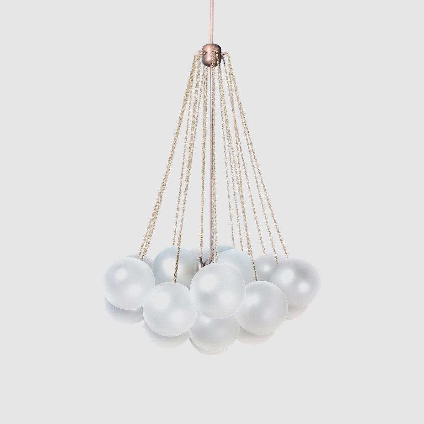
“Cloud 19″ pendant by New York atelier Apparatus
Extensive use of Italian marble in bathrooms, kitchen and fireplaces design
Some of the apartments have terraces facing the courtyard
Entrance hallway. Ceilings are 3.4m high.

GET THE LOOK

  1. 190 Sofa, Pierre Augustine Rose
  2. Selfoss sconce, Aerin
  3. Little Petra lounge chiar, &Tradition
  4. Rosewood and cane chair by Joaquim Tenreiro
  5. Cloud 19 pendant, Apparatus
  6. Pilotis side table by Malgorzata Buny for The New Craftsman
  7. Trapeze pendant, Apparatus

Found on VOGUE AUSTRALIA Photo Taran Wilkhu Featured photo Simon Upton

Follow: